Pure CSS Flipcard Based Login & Signup Form
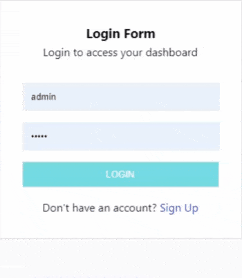
In my previous post Create a Simple Responsive Login Form With Html and CSS. You learned how to build a simple and responsive login form from scratch. Now in this post, you will learn how to build a pure CSS flip-able card Login and Registration form combo. Take a look below to clearly understand what I mean.
Please note I have used the same HTML form in this project like the one in the previous post if you need more details about it you can take a look at the previous post here. This is a pure HTML & CSS project no Javascript has been used. You can follow the tutorial to learn how to build this form from scratch.
When you complete this tutorial you would have fully understood the code and ultimately be able to build a flip-able login and signup form yourself. I have used CSS3 transitions and transformations and a few other CSS properties and attributes which I have explained wherever necessary.
Setup the Project
This project is completely built purely using HTML & CSS and the simplicity of it is that you can write the code in Notepad or any other plain text editor of your choice or you may also use an advanced code editor like Visual Studio Code which is open source and absolutely free to use.
After you complete the code, you need to save the file with .html (dot html) extension for a browser to be able to understand the file and render it properly. You are advised to use a modern up-to-date web browser.
The Flipcard structure
This is the HTML structure for the flip card. You can place any content you like to make it flip-able, make sure to copy the CSS below it too.
<!DOCTYPE html>
<html lang="en">
<head>
    <title>Login or Register</title>
</head>
<body>
<div class="wrap">
    <label for="form_switch">Click here to flip</label>
        <input type="checkbox" id="form_switch">

    <div class="flipcard">
	<div class="flipcard-inner">
     	    <div class="flipcard-front">
                <!--Temporary-->
                <div style="width: 100%; background: #69d2e7; height: 300px; line-height:300px">
		   <h1>Front Side Text</h1>
                </div>

            </div>
   <div class="flipcard-back">
       <div class="temporary-box" style="width: 100%; background: #69d2e7; height: 300px; line-height:300px">
           <h1>Back Side Text</h1>
      </div>
  </div>
</div>
</div>
</div>
</body>
</html>
*{
margin:0;
padding: 0;
box-sizing: border-box;
}
html{
height: 100%;
}
body{
background: #fafafa;
font-family: 'Segoe UI', sans-serif;;
font-size: 1rem;
height: 100%;
line-height: 1.6;
}
.wrap {
width: 350px;
margin: 50px auto;
background: #fafafa;
}
.flipcard{
background-color: transparent;
width : 350px;
perspective: 1000px;
}
.flipcard-inner{
position: relative;
width: 100%;
height: 100%;
text-align: center;
transition: transform 0.8s;
transform-style: preserve-3d;
}
.flipcard-front, .flipcard-back{
position: absolute;
width: 100%;
height: 100%;
backface-visibility: hidden;
}
.flipcard-front{
color: black;
}
.flipcard-back{
    background-color: #69d2e7;
    transform: rotateY(180deg);
}
/*.flipcard:hover .flipcard-inner{
transform: rotateY(180deg);
}*/
input[type="checkbox"]:checked + .flipcard .flipcard-inner{
transform: rotateY(180deg);
} What is happening?
First, we lay out the structure of the CSS flip card, we create a simple parent wrapper with <div class="flipcard"> and then within it a <div class="flipcard-inner"> to wrap the inner structure then we go for the first face of the flip card, we name it <div class="flipcard-front"></div> then exactly adjacent to it the backside <div class="flipcard-back"></div> as you can see above.
Now using the CSS code above, we have set the styles for <div class="flipcard-inner"> . A transition: transform 0.8s; for a smooth transition from front to backside then transform-style: preserve-3d; to preserve the 3d effect when switching the sides.
We then position the front face and the back face of the card over the other, then using transformations, we horizontally rotate the back face of the card to 180 degrees, so that it remains hidden.
.flipcard-back{
background-color: #69d2e7;
transform: rotateY(180deg);
}The backface-visibility:hidden on both the faces of the card makes sure that the faces become invisible when flipped.
.flipcard-front, .flipcard-back{
     position: absolute;
     width: 100%;
     height: 100%;
     backface-visibility: hidden;
 }
The flip card can be flipped using hover events too, you can use the following CSS code to flip the card when hovering over.
.flipcard:hover .flipcard-inner{
    transform: rotateY(180deg);
}
The checkbox input is placed exactly above the flip card and it helps maintain the state of the flip using CSS + adjacent sibling combinator.
input[type="checkbox"]:checked + .flipcard .flipcard-inner{
            transform: rotateY(180deg);
}
Integrating the form
So far, we have completed the flip card and made it usable. Now, we need to integrate the login/signup form within the card. The thing is, its the same form I used in my previous forms tutorial. You can simply copy and paste it within front-face and back-face divs.
The complete code...
<!DOCTYPE html>
<html lang="en">
<head>
    <title>Login or Register</title>
    <style>
     *{
         margin:0;
         padding: 0;
         box-sizing: border-box;
      }
      html{
      	height: 100%;
      }
      body{
      	background: #fafafa;
	font-family: 'Segoe UI', sans-serif;;
      	font-size: 1rem;
      	height: 100%;
      	line-height: 1.6;
      }
      .wrap {
      	width: 350px;
      	margin: 50px auto;
      	background: #fafafa;
     }
    .login-form{
        width: 350px;
        margin: 0 auto;
        border: 1px solid #ddd;
        padding: 2rem;
        background: #ffffff;
    }
    .form-input{
        background: #fafafa;
        border: 1px solid #eeeeee;
        padding: 12px;
        width: 100%;
    }
    .form-group{
        margin-bottom: 1rem;
    }
    .form-button{
       background: #69d2e7;
       border: 1px solid #ddd;
       color: #ffffff;
       padding: 10px;
       width: 100%;
       text-transform: uppercase;
   }
   .form-button:hover{
       background: #69c8e7;
   }
   .form-header{
     text-align: center;
     margin-bottom : 2rem;
   }
   .form-footer{
     text-align: center;
    }
   .flipcard{
     background-color: transparent;
     width : 350px;
     perspective: 1000px;
   }
  .flipcard-inner{
    position: relative;
    width: 100%;
    height: 100%;
    text-align: center;
    transition: transform 0.8s;
    transform-style: preserve-3d;
   }
  .flipcard-front, .flipcard-back{
    position: absolute;
    width: 100%;
    height: 100%;
    backface-visibility: hidden;
   }
  .flipcard-front{
    color: black;
   }
  .flipcard-back{
    background-color: dodgerblue;
    transform: rotateY(180deg);
  }
  input[type="checkbox"]:checked + .flipcard .flipcard-inner{
    transform: rotateY(180deg);
  }
  .form-button-register{
     background: #2c91d8;
   }
   .form-button-register:hover{
     background: #2c91a8;
   }
.switch_form:before{
    content: " ";
    display: block;
    background:red;
}
.label-highlight{
    color: blue;
}
</style>
</head>
<body>
    <div class="wrap">
        <input type="checkbox" id="form_switch" style="display: none;">
	<div class="flipcard">
	    <div class="flipcard-inner">
		<div class="flipcard-front">
		    <form class="login-form" action="">
            		<div class="form-header">
                	    <h3>Login Form</h3>
                	    <p>Login to access your dashboard</p>
            		</div>
                        <!--Email Input-->
            		<div class="form-group">
		            <input type="text" class="form-input" name="email" placeholder="[email protected]">
            		</div>
            		<!--Password Input-->
            		<div class="form-group">
                	    <input type="password" class="form-input" name="password" placeholder="password">
            		</div>
            		<!--Login Button-->
            		<div class="form-group">
                	  <button class="form-button" type="submit">Login</button>
            		</div>
            		<div class="form-footer">
            		 Don't have an account? <label class="label-highlight" for="form_switch"> Sign Up </label>
            		</div>
        	</form>
	</div>
	<div class="flipcard-back">
             <form class="login-form" action="">
            	<div class="form-header">
             	    <h3>Signup Form</h3>
                    <p>Register for a new account</p>
            	</div>
		<!--Email Input-->
		<div class="form-group">
  		    <input type="text" class="form-input" name="email" placeholder="[email protected]">
            	</div>
            	<!--Password Input-->
            	<div class="form-group">
                   <input type="password" class="form-input" name="password" placeholder="Password">
            	</div>
            	<!--Password Input-->
            	<div class="form-group">
                    <input type="password" class="form-input" name="confirm_password" placeholder="Confirm Password">
            	</div>
            	<!--Login Button-->
            	<div class="form-group">
                    <button class="form-button form-button-register" type="submit">Signup</button>
            	</div>
            	<div class="form-footer">
            	    Already have an account? <label class="label-highlight" for="form_switch"> Login</label>
            	</div>
        </form>
    </div>
</div>
</div>
</div>
</body>
</html>
Pros & Cons
This form is best suited with AJAX or when used in a single-page application. When you're using the form without AJAX. Please note that when you submit the registration form with incorrect details, the feedback from the server won't be displayed until you manually flip the card, as it resets to the front face, you need to manually set it up using javascript the javascript below.
<script>
    var getUrlParameter = function getUrlParameter(sParam) {
    var sPageURL = window.location.search.substring(1),
    sURLVariables = sPageURL.split('&'),
    sParameterName,
    i;
    for (i = 0; i < sURLVariables.length; i++) {
        sParameterName = sURLVariables[i].split('=');
	if (sParameterName[0] === sParam) {
        return sParameterName[1] === undefined ? true :
        decodeURIComponent(sParameterName[1]);
   }
  }
};
if(getUrlParameter('register') == 'true')
{
   document.getElementById('flipcard-inner').style.transform = 'rotateY(180deg)';
		}
</script>
Conclusion
This is just a simple form combination using CSS transforms, you are free to use the code however you want. If you find any issue with the code or face any problems, please comment below and let me know it.

Aryan K
Creator Metabust.com
I am a Full stack developer and love to build stuffs with code. Metabust is my personal space I created to share my knowledge and experience on a wide range of things and connect with you people, If you're a developer you'll find it useful.
 Notification
A second ago
Notification
A second ago